Pages

Wednesday, December 18, 2013

New Business Card Design

So I use Vistaprint for my business cards.  I like it because it's a Canadian company and they're really affordable - plus, they have pretty good editing options, and the website and interface is really user-friendly.  Since I don't really have the skills to be a graphic designer, and cheat and use a combo of 'stock' design cards and my own images. 

Have I mentioned how I do everything in Word?  Yes.  I'm pretty ghetto over here.  Deal with it. 

I created the blog header above in Word.  Fancy!  I decided I liked the design so much I transferred it to the new business card design. 

"But Emily, didn't you just order new business cards a few months ago?"

Thanks for asking.  Yes, yes I did.  I love them.  They looked like this:

I thought they were pretty snazzy...and I loved how I'd managed to place the text just right...

Then I went to a local craft fair a few weeks later.  One of the vendors had chosen the same card style as me!  Quelle domage!  But I figured, 'hey, what's one similar card?'  ONLY IT WASN'T!

Then we moved to Picton.  And the cool coffee shop down the road has business cards this style.  *blergh*  Then I dropped my card off at an antiques shop that needs some refinishing work done....and they thought they recognized my card (cool!).  ONLY NOT COOL!  Nope, it was some other jerk's lovely individual's card.  *double blerg*

Needless to say, I went back to the drawing board....or, should we say 'chalkboard?'  I'm jumping on the 'chalk' trend...we'll see what happens.  It's not like I've really got a 'brand' established.  Or, like, a real business, so no sweat! 

Yeesh.

Here's the new style.  What do you think?


It's reversible!  And yes, it's kinda purple...see, the stock card that actually worked with the image I wanted to use was sort of purplish...so I adapted.  Trust me, I tried a lot of other options.  This is the best so far.  Also, I can get 250 of these for $30. 

Somebody show me a better deal!  I dare you! 

Monday, December 9, 2013

Felt Flower Bouquets

For my wedding in 2011, I ditched the typical flower arrangements and made my own  brooch bouquet.  I'm going to let you in on a secret: making a brooch bouquet, from vintage and other found brooches, even when you're frugal, is not really that inexpensive.  I probably spent just as much on my brooch bouquets for my sister (my maid of honour) and myself as I would have on fresh cut flowers.

HOWEVER....

Felt & button flower bouquets are adorable, funky and much more affordable!  I made these bouquets for a friend's wedding for much less than we would have paid for fresh cut flowers.


We even made felt & button flowers which played double duty as table centrepieces and wedding favours at the end of the night.  Each flower had a handwritten 'thank you' note attached with the wedding date on the reverse.


I'm not going to say these took no time at all...they were pretty time consuming, but it was fun and affordable - and unique!

And these are my lovely friends on their wedding day (sorry, don't have one of them with the flowers yet!).  
Aren't they gorgeous?!  

Friday, December 6, 2013

Chairs! Chairs! Chairs!

Brace yourself, I've got lots of before & afters coming at you....


Funky, right?  This chair was sponsored by a really eclectic store that sells unique home furnishings and other oddities collected from across Canada & Europe...I guess that inspires antlers?  And sweater-chairs? 


Beautiful butterflies!  There are two of these beauties, refinished by a colleague of mine, and they're stunners. 


These farm stools are pretty awesome - they even spin!  I made it so that the 'stamp' can be customized for whoever wins these.  They can choose their own letters/numbers to personalize it. 


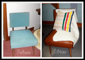
Faux fur throw and Hudson Bay inspired print on the pillow - this chair is sponsored by the New Canadians Centre, obviously! 


Not really much to look at when it's 'full frontal' (in buff beige, no less!), but a peek of colour on the back.  Surprise!  Not so boring after all. 


And I can't remember if I shared this "suit-able" chair before...it's covered in a wool suit fabric salvaged from a charity shop in town.


All the chairs are rescues and salvages, most from my trolling on Kijiji (good times!), and then lovingly refurbished.  They're auctioned off to support the YMCA Strong Kids Campaign - auction is Saturday night.

Can't wait!

Thursday, December 5, 2013

So you don't know anything about drafting (and that's OK!)

And you don't have Photoshop or any other cool editing program...

Hey, that's OK!  Neither do I! 

I do all my photo editing using a MS program and created these Farm Table table top designs using MS Word.  Sometimes, you don't need the fancy stuff (although I've heard it's nice....real nice). 

  • The first step was to turn on the 'grid' function so that I had what looks like graph paper (you can find that under 'View').  I also had to change the orientation of my page to landscape, and change the paper size to 11x14 to fit it all in.  
  • Using the grid lines I went to Insert>Shape and selected a box/rectangle.  Then I counted out the size of my pieces of wood...one square = one inch.  The light grey rectangles vary in length but are 6" wide. 
  • I made a bunch of 'wood planks' out of boxes and then I had fun playing around with patterns and designs. 
  • Make sure you count out the proper sizes by using the grid as a guide!  The pieces  in option A are 6"x48", 6"x36", 6"x24" the short are 6"x12".  You have to count - otherwise you won't know how long your pieces are, or what to cut when you get to that part. 
  • I added 'nails' by creating teeny tiny circles and then using copy & paste a lot.  *Hint*  It's easier if you create a row, then 'group' the individual circles, and then copy & paste the rows.  You can rotate the rows to get them running in the direction you need (ie: horizontally or vertically). 
That's pretty much it! 

So the farm table I made using Ana White's plans has been popular, and I have a request for another. 

This time I'm offering a couple of options for table top 'layout.'  Here they are:


Option A is a little more 'rustic' perhaps, giving the impression of more 'salvaged' wood, while Option B is a bit more 'streamlined.'


They're ready to send off now. 

Easy peasy!